How does your business card stack up?

A few years ago, we did an analysis of business cards we had received at networking events. We looked at color, paper, size, orientation, information, and overall appearance. Since it’s been a few years, we decided to do a similar experiment on a new stack of cards.
When a client asks us to design a business card for them, they often say they want a card that stands out. One that gets noticed. One that’s unique to them. But what exactly does that mean?
Well, here’s what we learned from the 100 cards we analyzed from Tim’s stack of cards. Why did we pick 100 cards? Because round numbers are good when it comes to math.
Color
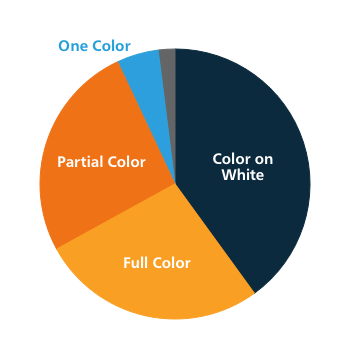
Color is a relatively quick thing to analyze. Most cards include some sort of color, with a little less than half being color text on a white background.
This time around, we split our more colorful cards into two categories: full color background, meaning the entire background of the card was color, and partial color background, meaning there was an accent stripe or some portion of background color but still some white on the card.
- Full color background 27%
- Partial color background 26%
- Color text on white 40%
- One color text 5%
- Black and white 2%
One Sided vs Two Sided
This time around, we saw even more two-sided cards than last time. Two-sided cards are still clearly a winner.
- One: 36%
- Two: 64%
Paper
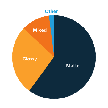
Next up is paper type. Matte cards are still clearly in the lead here, although glossy is starting to gain some ground.
We also broke out those cards with a mixed appearance, meaning those that had both glossy and matte elements on the card. The other category includes a transparent card and a linen card.
- Matte: 60%
- Glossy 27%
- Mixed: 11%
- Other: 2%
Size
The vast majority of cards were the standard size of 3.5” x 2”. But not everybody can be normal, right? Some cards were slightly larger, some slightly smaller, and some with rounded edges, which we counted as Other.
- Standard: 90%
- Other: 10%
Orientation
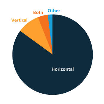
Most cards are still a basic horizontal layout. It’s typically what people expect with a business card, but some people like to mix it up.
Some cards had a horizontal layout on one side and a vertical on the other.
The other category here represents square cards.
- Horizontal 85%
- Vertical 9%
- Both 4%
- Other 2%
Gimmicks
The little details are where some cards start to really stand out. This time around, we saw a higher percentage of embossed and spot UV coated cards, while the percentage of rounded corners dropped a bit.
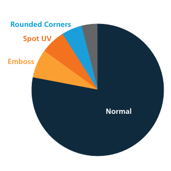
Spot UV coating is when only a portion of the card, such as the logos or specific text, appear glossy. The other category includes square, transparent, and iridescent cards.
- Normal: 78%
- Rounded corners: 5%
- Spot UV: 6%
- Embossed: 7%
- Other: 4% (square, transparent, iridescent)
Information
The stack of cards we analyzed contained different information, which we wanted to analyze and compare to our prior stats. The biggest change we saw here was in the percentage of cards that listed a fax number. In 2014, 53% of cards contained a fax, whereas now only 38% do. We expect that number to decline more in the future.
- Email: 95%
- Website: 90%
- Address: 71%
- Person’s Title: 77%
- Fax: 38%
- Photo: 5%
- QR Codes: 3%
- Updated Information: 1%
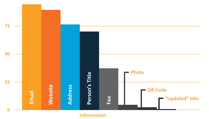
The updated information category means a card with information crossed out because it was no longer accurate.
Rating
And now we get subjective: exactly how much did I like the card designs? These are my opinions alone, and it’s possible another graphic designer would rate them differently. But here they are!
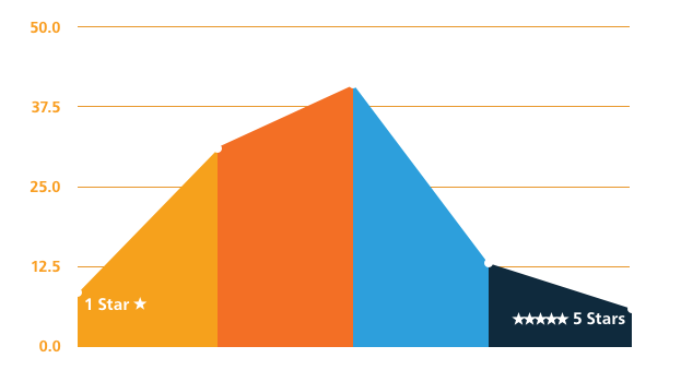
- 5 Stars: 6%
- 4 Stars: 13%
- 3 Stars: 41%
- 2 Stars: 31%
- 1 Star: 9%
The rating scale goes something like this:
- 5 Stars : Quality design-work, exceptional creativity.
- 4 Stars : Great branding, professional, just needs a bit more polish.
- 3 Stars : Professional, but lost within the pack because it doesn’t stand out.
- 2 Stars : Okay, but could use some improvements.
- 1 Star : Needs to be redesigned yesterday.
There you have it! Our updated business card analysis. So if you want your card to stand out from the crowd, think about these elements.
I’m curious!
Of the 6% that were given 5 stars, how many of those cards had the elements listed in the post?
Thanks!
Hey there, Jesse! Great question. The 5-star ranked cards all had something special about them (that may or may not have been specifically mentioned in this post), but not necessarily the same special something as one another.
Whether that was a unique size of card, heavier paper stock, creative branding, some sort of embossed feature, or just a really clean design, it stood apart from the pack in some way.
So it’s not necessarily about having all of the features in your business card, but rather, having your card stand out in a good way from the rest.
Hope that helps! 🙂
Great article Holly. Thanks.
I am curious about how much cost affects purchase. In other words, does the cost have a priority for the majority of people who purchase business cards?
Also, is the increase in price for a multi-color card worth the investment? Are people more likely to refer back to them if they are more creative / colorful?
Kathy
Glad you liked it, Kathy!
Like with many things, you get what you pay for. Having a really high-quality paper stock makes a huge difference in the impact your cards can make. And having a solid design can create a great impression for your business.
But really, I think it all starts with the foundation of your brand. If you have a great, solid brand for your business (like your logo, colors, and overall look and feel), it’s going to take less work to make your card awesome, because your brand is awesome! The cards that I ranked as 5-star all had a very strong brand image, and didn’t overload their cards with too many details (a common problem in business cards!).
And I definitely think a multi-color card is worth it. The price difference really isn’t that much greater. The biggest price increase for business cards tends to be found with custom shapes/sizes, higher-quality paper stocks, or other special features like emboss or foil finishes.
Let me know if you have any other questions – I’d be happy to chat! 🙂
Hey.. Thanks for sharing the information graphically. This method will help the people to decide the card design and also help to analyze that which card is more popular in the market