Note: We have a 2017 edition of these business card statistics available also.
When clients come to us for a new business card design for their business, they often have the same request. They want to stand out from the pack with a card that is unique and effective.
That’s a simple enough request, but in order to know how to stand out from the pack, we must first know what kinds of cards are a part of the pack.
We decided to take 100 cards (for simple round number purposes) from Tim’s stash of business card contacts, and see what all they have in common, how they are different, and what ones stand out.
All of these cards are from contacts in Oklahoma, and were picked at random for the study.
Color
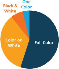
The first tally we took was color. Almost all of the cards had some sort of color, but about a third of the cards were simple color on white.
- Full Color: 55%
- Color on White: 34%
- Black & White: 7%
- One Color: 4%
One Sided vs Two Sided
This category was quite evenly split, but the two-sided cards took the win.
- Two-Sided: 55%
- One-Sided: 45%
Paper
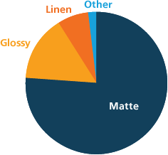
Next, we tested the paper types. An overwhelming majority were matte, followed by glossy, and then linen.
Two outliers were very unique: metal with a die-cut, and transparent.
- Matte: 76%
- Glossy: 15%
- Linen: 7%
- Other: 2%
Size
Almost all of the cards we looked at were the normal 3.5” x 2” size. There were, of course, some variations that are expected when they are all from different printers.
Some cards changed things up slightly with different size ratios, or just a slightly longer, shorter, or wider card.
- 3.5” x 2”: 90%
- Other: 10%
Orientation
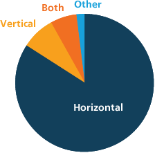
This category also had two outliers: a round card (that’s ours!), and a card with a swivel feature that allows the card to fold up.
A vast majority of cards keep things simple with a horizontal orientation, which makes all the others stand out. The cards under Both feature one side with a horizontal orientation, and the other with a vertical orientation.
- Horizontal: 84%
- Vertical: 8%
- Both: 6%
- Other: 2%
Gimmicks
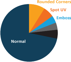
Some of the things that will help your card stand out are in the details. The most popular gimmick was the rounded corner, followed by spot-UV coating (Spot-UV coating is a selective glossy coat, usually found only on text or logos, instead of the whole card being coated).
Cards in the other category included ones that were transparent, metal, circular, rhombus, and a swivel ring.
- Rounded Corners: 9%
- Spot UV: 6%
- Emboss: 4%
- Foil: 4%
- Other: 5%
Information
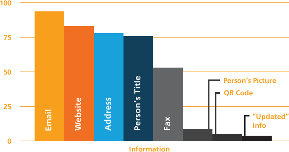
Not all of the cards had the same information present, so the next tally we took was for the many kinds of contact or personal information listed.
- Email: 94%
- Website: 83%
- Address: 78%
- Person’s Title: 76%
- Fax: 53%
- Person’s Picture: 9%
- QR Code: 5%
- “Updated” Information: 4%
The updated information category is a special one. These were the cards where the person crossed out something on their card because it was no longer accurate.
Appearance
Finally, I took the only subjective tally of the day. As a designer, I have high standards for design work, but these are only my opinions.
I ranked each card from 1 star to 5 stars. Here are the scores:
- 5 Stars : 4%
- 4 Stars : 11%
- 3 Stars : 46%
- 2 Stars : 32%
- 1 Star : 7%
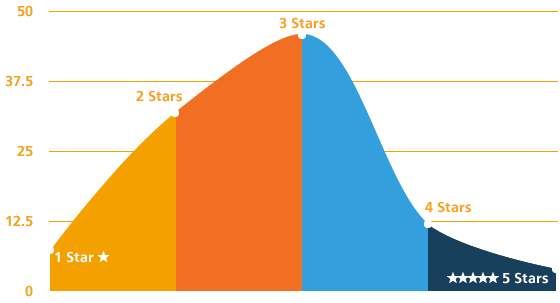
So what determined the scores here? Professionalism, creativity, branding and effectiveness. Here is the breakdown for each rank:
- 5 Stars : Quality design-work, exceptional creativity.
- 4 Stars : Great branding, professional, just needs a bit more polish.
- 3 Stars : Professional, but lost within the pack because it doesn’t stand out.
- 2 Stars : Okay, but could use some improvements.
- 1 Star : Needs to be redesigned yesterday.


Would love to see a “before & after” of a 1, 2, 3 and 4-star business cards!
We can appreciate that, Julie. However, I imagine many of our clients are embarrassed of their original business card, and wouldn’t want to show it alongside their new one.