Looking for a foundation to start designing your website strategically? Whether you’re working with a web design agency, freelancer, or going the DIY route, two of the early design elements to start with are your fonts and colors.
Let’s look at what you need to know about fonts, some font resources, then what you need to know about colors and some color resources. If you’re a WordPress fan like we are here at T&S, I’ve even got some WordPress specific tools and tips in the mix.
What your font says about you
At the college I attended, they have an entire course on Typography As Visual Language. But you likely don’t have the time to take an entire course about fonts! So we’ll just cover the types of fonts, then the weight and width.
Types of fonts
Although there are more categories than this, let’s simplify things by talking about two main font categories:
- Serif
- Sans-serif
Serif fonts
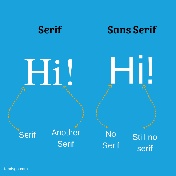
Times New Roman is a classic example of a serif font. A serif—or foot—is those little extensions at the end of every leg and stem of the letter. Popular belief states that serifs exist because of the stone carving tools that were around during the Roman empire. To make the lettering clean and aesthetically pleasing—and to make sure everything lined up—the carver would turn their chisel at the end and add the serif.
Serif fonts are often used to indicate sophistication, maturity, or formality.
Sans-serif fonts
Arial is a classic example of a sans-serif font. Sans serif fonts are called that simply because they don’t have the serifs. They have become the most popular option for displaying text on computer screens and more recently mobile device screens.
Sans-serif fonts are often used to convey that something is modern, clean, and trendy.
In the digital marketing world, sans-serif fonts are most often used for body text while serif fonts are most often used for headlines.
Weight and width of fonts
Two factors to consider when picking your font are the weight and the width.
Font weight
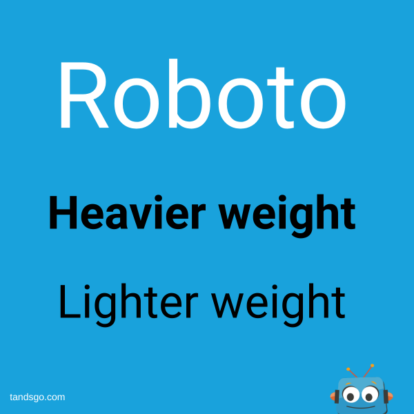
Wondering how a font can have weight? The weight doesn’t refer to how hard it is to lift off the ground! Font weight actually refers to the thickness of the lines in the letters.
Let’s take the Google Font Roboto as an example. Roboto with a weight of 900 is three times as thick as Roboto with a weight of 300.
Often times you’ll see simplified weights that don’t include the actual number:
- Thin
- Light
- Regular
- Medium
- Bold
- Black
That list starts at the lightest and ends with the heaviest or thickest.
Font width
Width is how much horizontal space the letters of a font take up. Tall, narrow fonts can give you a sleek high-end look. Wider fonts tend to be more decorative and should be used on a case-by-case basis.
I’m a fan of the wider Google Font Corben. I like how it’s easy to read and classic looking. You feel like you’re looking at 1960s print advertising! It’s a great example of how width—and weight—can impact the feeling a font gives you. It can even make for great, mature looking copy in a smaller weight.
Choosing a font for your website
Okay, that’s all well and good, but how do you actually go about choosing fonts for your website?
First, keep it simple. Don’t have a million different fonts. A solid font for your headers matched with another for body copy is really the most you will need. Some folks go a step further and utilize a single font family, changing only the weight and size based on the usage. That definitely keeps things simple.
Want even better news? If you liked Roboto, Corben, or any of the other Google Fonts, they’re open source and free to use on your website. As you browse, Google will even suggest other fonts to pair with the one you’re looking at.
Font resources
If you’re going the DIY route, here are some font resources for you:
- Google Fonts
- Font Squirrel
- How to install Google Fonts on your website
- Easy Google Fonts WordPress plugin
- Web Fonts & Typography Starter Guide For HTML Developers
Types of color palettes

Okay, let’s move on to colors. Not all color palettes are created equal! Here are there four main types of color palettes:
- A monochromatic color palette is one color, but with different shades and tints.
- A triadic color palette takes the color wheel and selects three points that are equidistant from each other. The easiest example of this is one using red, blue, and yellow.
- An analogous color palette means the secondary and tertiary colors are selected from the left and right sides of the main color on the color wheel.
- A complementary color palette means the main colors are opposites of each other.
Okay, maybe that’s a bit overwhelming if you don’t have a graphic design degree. You can always start with your favorite color or use an online tool to come up with a color scheme. If you’re working with a professional graphic designer, he or she will help you understand which color fits your organization and target market the best.
Using an accent color
What else do you need to know about color?
Just like with your font selection, less is more. Three is a good rule of thumb if you’re not a designer. That number lets you use the 60-30-10 rule:
- 60% of the time you use your primary color
- 30% of the time you use your secondary color
- 10% of the time you use an accent color to grab attention with an exciting pop
How do you create a color palette?
If you’re going the DIY route, here are some great color palette generators:
Of course, all of this is much easier with professional guidance. If you find yourself getting frustrated or overwhelmed, don’t hesitate to bring in a web designer or graphic designer to help!


