Picking a replacement web font

So you’ve been using an awesome font you love in all your print material. It looks great on your business cards, your brochures, and your fliers. Then you tell your web gal—or guy—that you want to use it on your website as well.
Houston, we have a problem!
If you originally picked a font for print material then tried to use it on your website as well, there’s a decent chance it’s not available as a web font.
Years ago, there were only a dozen or so fonts that were considered web-friendly. And while we’ve come a long way since then, there are still issues that prevent you from using any old font on your website.
So what’s a web gal to do?
Pick a new font, of course! But you probably don’t want to redo all your print material, as that can be really expensive. So instead, you need to pick a font that’s close to your existing font.
Let’s take a look at how to do that.
Pick a provider
There are a handful of different web font providers. This is not a comprehensive list, of course, but all of these are free.
Be aware that some of those sources (especially Font Squirrel) also have fonts that are not web fonts. Be sure to check your search filters to make sure you’re only looking at web fonts!
Our personal favorite is Google Fonts, as there are a lot of super easy ways to integrate it into WordPress websites.
Pick the font
So when you’re looking at all those websites, how can you actually find a replacement font?
There are a number of factors you want to look at. Some sites will even filter their list using these factors. But you definitely want to check them regardless.
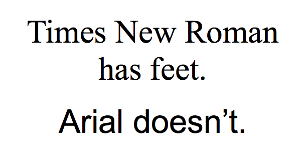
Serif vs. sans serif – When you look at the letters, do they have “feet” or no “feet” on them? Serif fonts have feet. Sans serif fonts don’t.
Handwriting – Pretty self explanatory. Does the font look like handwriting?
Monospace – Is every character the same width? Personally, I think these look a little goofy, but they were pretty common in old computer fonts, if that’s the style you’re going for.
Open areas – What is the spacing in the open areas of letters?
Width – Is the font narrow or wide?
Be sure to look at other characteristics as well. Does it have rounded corners? Is there a blocky feel overall or lightweight feel? Is it more creative and stylized or plain and clean?
If you have examples of the font, be sure to closely examine each letter in your example to see how it compares with the font you’re thinking about replacing it with. How close is it? Are you okay with any slight differences?
If you have access to the original font on your computer, test out both fonts. You can even use something my nerdy writer friends told me about, a pangram. That’s a sentence that has every letter in the alphabet at least once.
My personal favorite? “The quick brown fox jumps over the lazy dog.”
Whatever font you go with, just be sure it’s not Papyrus or Comic Sans. Gross.