The Art of Typography
Many designers come up with amazing concepts while brainstorming for a project, and everything appears to be perfect up until the actual design starts. Many times, the artwork doesn’t always emphasize the potential of the original idea. One of the biggest problems is the wrong use of typefaces.
Something every designer should understand is the importance of typography and how using the correct typeface will solve many problems. Many professionals will choose a top 20 typefaces and only use those: the fewer, the better. Here is a common list of typefaces:
- Centaur
- Jenson
- Bembo
- (Adobe) Garamond
- Minion
- Times New Roman
- Baskerville
- Mrs. Eaves
- Bauer Bodoni
- Didot
- Clarendon
- Rockwell
- Serifa
- Franklin Gothic
- News Gothic
- Helvetica Neue
- Univers
- Futura
- Fruitger
- Copperplate Gothic
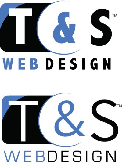
The right typeface can make all the difference in the world and change the feel of the design. Businesses need to convey their identity through their logo, and the typeface can make or break this communication. Here is an example (to the right), showing how a typeface can change the logo. The correct logo on the bottom displays a more professional feel, where the top logo feels more playful and doesn’t suit the company.