Lessons from the homepage of the top five websites

The web is amazing. And scary. And crazy. But I can’t imagine life without it. In fact, without giving away my exact age, the web is (barely) older than I am. So I’ve literally never lived in a world without the web.
And I wouldn’t want to!
In our line of work, we get to see a lot of websites. And while sometimes I can’t close the window fast enough, other times there are lessons to be learned.
With that, let’s take a look at the top five websites according to Moz’s list of the most popular 500 websites on the internet, and one lesson you can learn from each website.
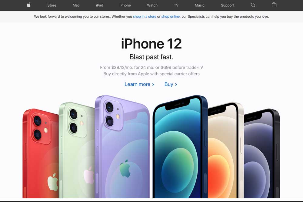
Apple
I’ve been a big fan of Apple’s marketing efforts for a long time. For years now, their website has been extremely clean and easy to navigate. What makes that work well? Beautiful photography.
Apple’s website showcases excellent product photography front and center. And as you scroll down, you’re shown even more amazing photographs, all of which make me want to spend way too much on Apple products.
If you’re not investing in beautiful photography for your own website, it’s time to start! I can’t tell you how many times clients showed me a website they loved, and I had to explain to them that the reason it looked so amazing was because of the photography. In fact, visual learners make up 65% of the population!
The lesson: Beautiful photography wins the day.
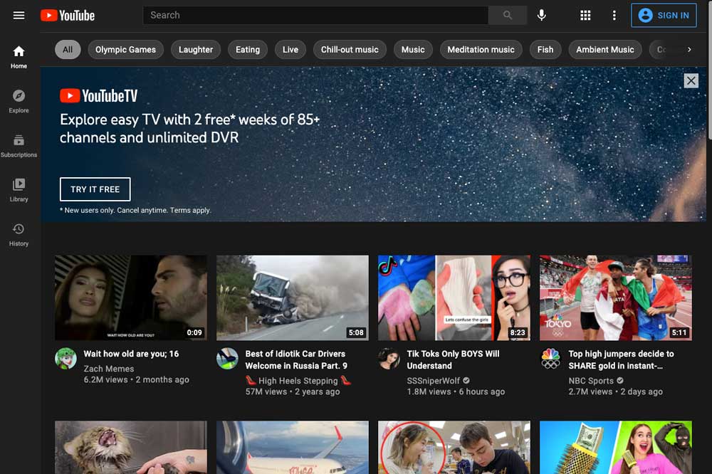
YouTube
YouTube’s homepage keeps the videos front and center. They’ve got enticing thumbnails, video titles, and even the social signals that let you know how many people have already watched the video.
As of 2021, 83.8% of internet users accessed digital video content. And that has trended up for years!
Just like great photography, you need to invest in video. The good news is that many businesses and nonprofits can get away with just having a video on their home page. One really good-looking video is way better than a bunch of videos you recorded on your iPhone. Those can work for social media, but your website needs to be more professional than that.
The lesson: If you’re not using video, you’re missing out.
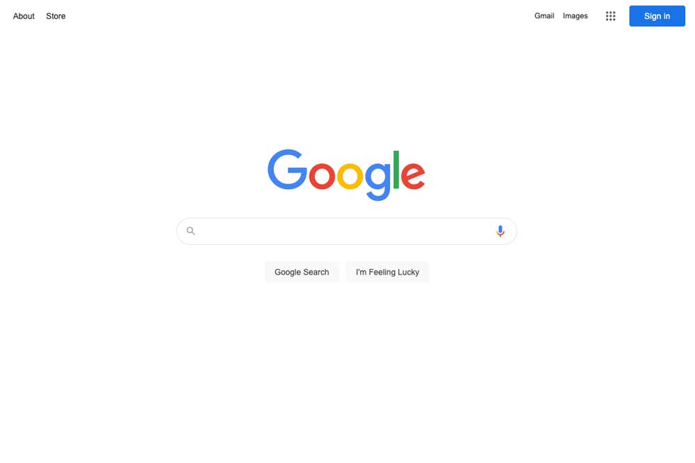
I can’t tell you how many times a day I use Google. In fact, if I’d used a different list of the most popular websites, Google would have come in first place. Why is that?
Well, going back to the very first versions of Google, they’ve always kept a minimalist homepage with all the focus on search. Unlike other search engines in the nineties, they didn’t cram their home page full of articles and other links.
While you probably can’t get away with the same ultra-minimalism that Google does, make an effort to keep only the most important things on your homepage.
The lesson: Your homepage should only have the most important things on it. Prioritize!
Blogger
When you visit the Blogger website, it’s immediately apparent what they want you to do: create your blog. There’s no clutter, no confusion. They have some subtle animation and clean illustrations on there as well, but everything points to the button with the text, “Create Your Blog.”
Even as you scroll down, everything continues to point to that same next step. It would be tempting for them to put a directory of blogs on there, but they don’t. It’s all geared toward creating your blog.
When someone else visits your home page, how obvious is the next step to them? Is there a big clear Call To Action button in the middle of the homepage? Would any visitor to your website know what they should do next?
The lesson: Make the clear next step obvious with a clear Call To Action.

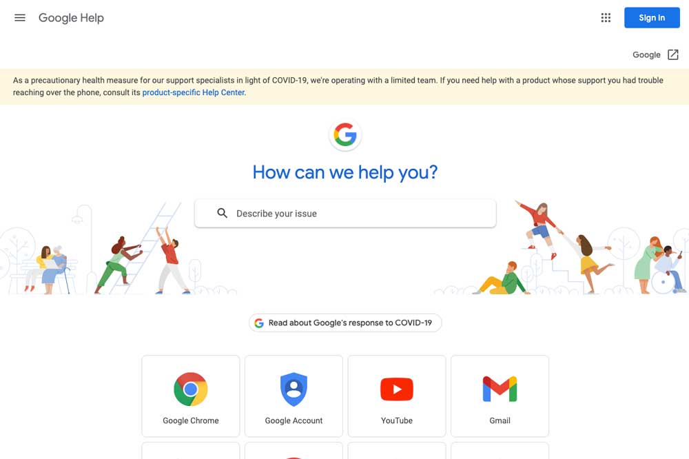
Google Help
I could be snarky and talk about how some of Google’s products must be unnecessarily complicated to use if their help website is the fifth most popular website on the internet. But I won’t.
While the homepage for Google Help has a lot more going on than Google’s main website, it’s still pretty minimal. Even with the number of products and services they have help for, the most common ones are quickly available. The complete list of options is initially hidden, although it’s easy to find it by clicking the big down arrow beneath the primary list.
Have you made your website easy to navigate? Which pages are people visiting most often? Which ones do you want them to visit? Are those more easily accessible through your homepage than others?
The lesson: Your website should be easy to navigate.
A good-looking, effective website is a must for every business and nonprofit. Which of these lessons can you take and apply to your website?
If we manage your website and you’d like to talk about applying any of these lessons, please reach out! Or if we don’t manage your website and you’d like help with a new one, we would be happy to talk.