Improve Content Absorption
Hey, I’m Elyssa Dolinger, a recent T&S designer hire (Yeah! Helping to even out our designer/programmer ratio.) and I believe strongly in the power of information design.
Print design theory can really help in classing up a web page. More importantly, print designers are used to working with a lot of content. A lot of times people want a lot of content on their web pages. We’ve learned a few things here and there to make content not only readable, but understandable.
Little tricks like the “rag” of a block of text and “leading” and “kerning” can take a page from unintelligible to just plain classy. It’s amazing what small changes to spacing can do for comprehension.
So, what are these amazing tricks, you ask?
Paragraph breaks: Yep. You heard me. Paragraph Breaks. If a reader sees a GIANT BLOCK OF TEXT, they will skip it every time. Give them hope that they can finish your content in the form of spacing between paragraphs.
Rag: The rag is the right hand side of a left-aligned block of text. (Or, conversely, the left hand side of a right-aligned block of text.) Confusing? Yeah. Here’s a picture.
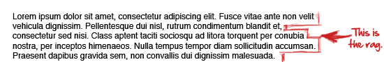
The rag helps people keep track of where they are when they are reading. If a block of text is justified-aligned, there are no visual clues to help the reader. (Also it messes up your kearning.) The reader is more likely to loose track of where they are in your paragraph. Rather than start all over again, most will abandon the attempt.
Center-aligned or justified-aligned blocks of text are not advisable as far as large blocks of text go, but are okay as far as single lines are concerned.
Leading: Leading (rhymes with heading) is the vertical space between lines of text. It’s sometimes called line-spacing. The more leading you use, the easier a block of text is to read. Too much leading, though, and you’re wasting space.
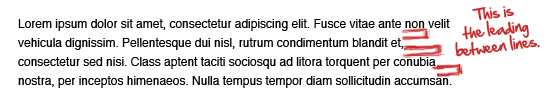
See how this block of text (as opposed to the one about rag) seems somehow more approachable? This block of text has about 50% more leading than default.
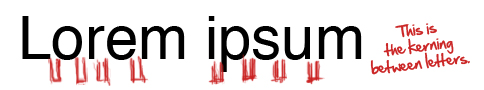
Kerning: Kerning is the horizontal spacing between individual letters. It is sometimes referred to as tracking. This is most helpful in the case of headlines or specialty “decorative” fonts. (You know, the fonts used in logos and super cool web pages?) Most everyday use fonts or web safe fonts have the kerning ironed out already.
Utilizing these 4 tricks, you too can make any content readable, understandable, and absorbable.